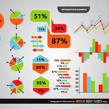
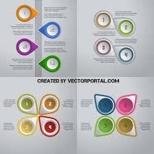
Often, the necessary information about a product is visible without a detailed description – it is placed directly on the images. We tell you how to design a visual card to attract the buyer’s attention.
Types of Infographics for Marketplaces
Infographic requirements for marketplaces
Programs and applications for creating infographics
What skills do you need to create infographics?
How to Create Infographics If You Don’t Want to Understand Programs
Possible Mistakes When Creating Infographics
Expert Advice
Types of Infographics for Marketplaces
Table of Contents
Infographics for marketplaces are usually collages of photos and text with icons that highlight the advantages of products on product cards . The type of infographics depends on the purpose:
1. Show the product’s benefits
In an infographic for a sports bag card that you can take to a workout or on a trip, it’s best to highlight the waterproof seams, a place to store shoes, and the fact that it can be taken as carry-on luggage.
2. Show the product’s use cases
For example, water scrapers differ only in color and plastic quality. To distinguish such a product from competitors, you need to show in infographics how it can be used: wash a window, clean a car windshield from insects, wash bathroom tiles, clean a car from snow (rubber does not harden in the cold). This will increase the value of the tool, because it can replace several different brushes.
3. Tell what is included in the kit
Sometimes even such a minor detail as batteries can influence the buyer’s choice. For example, when he orders a toy for a child. If the battery is included in the kit, you can immediately check how the toy works, and the client will not have to waste time looking for the right type of battery.
4. Show how the product affects the result
When a person buys, for example, a robot vacuum cleaner, he does not need a vacuum cleaner, but a clean floor. In infographics, you can show how the product copes with its tasks.
5. Help the buyer choose
In different countries, the parameters in the size chart may differ. The buyer will order the usual “eska”, but it turns out that the dress is small. Therefore, the infographic additionally shows the length, width, chest and shoulder circumference for each item of clothing. Or give instructions on how to measure yourself correctly so as not to make a mistake with the size.
6. Provide useful information for a specific type of product
For example, the buyer is not so concerned about the color of the power bank or the material it is made of. Therefore, in the infographic, it is better to tell how many hours its capacity will last, what cable is suitable and what gadgets can be charged.
Read Also:What is Compliância ? Details Overview
Infographic requirements for marketplaces
In design and marketing, there is a three-second rule. This means that if after 2-4 seconds the user is not interested in the image or video, he will close it or scroll further.
This rule also works on marketplaces, but sellers use it differently. For example, a couple of years ago, product cards were full of aggressive infographics with bars: “last product”, “discount”, “sale”. Now marketplaces have started to conduct moderation. For example, Ozon does not allow attracting people’s attention with advertising bars, so as not to deceive expectations.
Historically, Wildberries has more infographics — customers are used to having them, and sellers use them. Infographics appeared on the Ozon marketplace recently. Before that, products were often placed on a white background. Now the platform gives more freedom — you can add your own design to the cards. At the same time, Ozon has drawn up requirements for images with examples of working infographics . So the platform immediately creates a visual code that sellers can use as a guide.
Ozon’s requirements for infographics can also be used on Wildberries, but the technical features of the platform must be taken into account.
Programs and applications for creating infographics
Until 2022, the most popular tool for creating infographics for marketplaces was Canva. It is easy to master even with zero knowledge of design, it offers many ready-made templates, fonts and individual elements. Now Canva is difficult to use in Russia, but there are alternatives:
Adobe Express
is a free analogue of Canva. It allows you to create both static and animated images for infographics on marketplaces . You can choose a template for an image that already contains sizes suitable for different social networks and other platforms. There is a function to “get rid of the background” in the picture . Adobe releases many tutorials on the application to make it easier for the user to work in it.
WBcard
is a layout designer specifically for Wildberries and Ozon. It takes into account the features of both platforms. The main disadvantage is that infographic templates for Ozon are only available in the paid plan.
Figma
is a graphic editor that designers most often use to create prototypes and layouts of websites and applications. Figma does not have ready-made templates for marketplaces – you will have to create them from scratch. Another difficulty is in the interface, so far there is only an English version.
What skills do you need to create infographics?
In addition to software skills, basic graphic design skills and an understanding of how visual perception works will come in handy. Buyers may differ in cultural context and education, but evolutionarily their attention is controlled by the same instincts. They helped ancient people hunt, survive, and recognize their own. This feature is most often used in advertising and design, including when creating images for marketplaces. For example, a bright or warm color attracts because once upon a time, people used this feature to find food or notice a poisonous snake.
Let’s say a customer chooses a basic black bag. A search on marketplaces will show hundreds of such products. The eye will catch the one that is placed on a warmer background, even if at first glance it appears white. Here are a few more design tricks for different product categories:
Cosmetics and hygiene products
Blue, green and white are most often used for images. White creates a sense of purity – cosmetics are associated with the laboratories where they are produced. Green symbolizes the naturalness of the product, so images of green leaves are often added to infographics. If water is used in the layout, it is better to make it blue to create an association with a clean mountain lake.
Detergents
the visual depends on the product packaging. To make it stand out more, it is placed on a contrasting background, and the infographics can echo one of the product details in color. It is better to choose either natural colors or the colors of vegetables and fruits — they make you want to buy (for ancient people — eat).
Clothing
Infographics for marketplaces depend on the type of clothing. For example, for winter jackets, you can specify in text what temperature they can withstand and whether they have a water-repellent coating. Infographics will work better if they are placed on a collage with a mountain landscape. Clothing for mountain tourism is usually high-quality and durable. It is good if the model’s face is visible in the image – our visual perception is evolutionarily tuned to recognize our own kind.
How to Create Infographics If You Don’t Want to Understand Programs
It will take time to master the programs and design basics, and the result may not meet expectations. Therefore, marketplace managers often assign the creation of infographics to a designer. You can find a designer on a freelance exchange like workzilla or in specialized Telegram channels, for example, in “World of Creators” . Beginning designers often look for part-time work there and can complete an order for a review on social networks.
In order for the designer to quickly understand the task and draw a good layout, you need to draw up a technical task for him to create infographics . An alternative option is to request the technical task, according to which the designer usually works, with examples of filling. Here is an approximate structure of such a document.
Chapter
Example
Tasks
– Show the value of the product
– Stand out from the competition
– Increase the clickability of the first photo
– Create a genuine desire to purchase the product
References
Let’s say the layouts are for smart watches. Add 5-10 links to successful cards of similar products or products from related niches
Recommendations for layouts
Layout 1 (Main photo)
Captions:
Smart watch
Holds a charge for 5 days
Waterproof
Stylish straps
Always be connected and in style
Show the watch from different angles and on the hand
Video inside
Layout 2
Show the product in close-up, add some of its benefits
Dimensions
One of the main criteria for a competent technical task is realistic examples. Even an experienced designer will not be able to quickly prepare a layout based on a reference that a whole team worked on. The image design should not be complicated – with textures, neon gradients and other trendy effects. In infographics, it is important to provide benefits, and this can be done with the simplest tools.
Read Also:ILikeComox: Everything You Need To Know
Possible Mistakes When Creating Infographics
Infographics for marketplaces can affect product sales. For example, the marketing budget is growing, but conversions are decreasing. The reasons may vary — from the quality of the product to the design of its card. Here’s what can affect the effectiveness of infographics:
❌ Poor quality photo
A beautiful infographic combined with a photo taken on a phone in poor light is worse than a good photo and basic infographic. In addition, good quality images do not need to be processed in professional graphic editors.
❌ The image is overloaded with information
The buyer to begin with looks at the item itself, and after that peruses the content on the picture. It is critical to form beyond any doubt that the infographic does not draw consideration to itself.
❌ The product is praised without specifics
For example, the infographic for a vegetable cutter states that it is an innovative product. Each buyer can interpret such a description in their own way, and when they see the product in person, they will be upset that it does not meet their expectations.
❌ Focus only on the first image
In addition to the first layout, the product card usually has 3-6 additional images that the buyer will also scroll through. For example, size charts, specifications, application tips. This information should be formatted according to the same rules as the main image. Use the same color combinations, icons instead of long text, size breakdowns in centimeters. This will make it easier for the buyer to choose a product.
❌ They don’t test different infographic options
It’s impossible to predict which design will attract a buyer. To choose the one that will bring a higher conversion, you need to prepare several layouts and test them on both Ozon and Wildberries. Sometimes the designer or marketplace manager doesn’t like the layout, but the buyers are delighted.
❌ They do not rely on the buyer’s needs
For example, it may seem that the image should advertise a bandage corset as a thing that will make a woman attractive. But many people buy them after giving birth, when they need to support their back and speed up recovery. They hardly think about attracting the attention of others.


